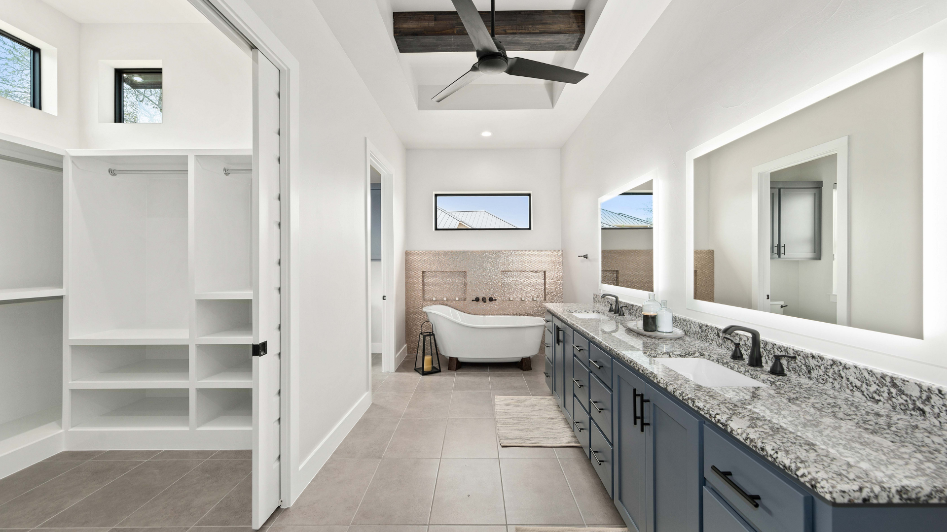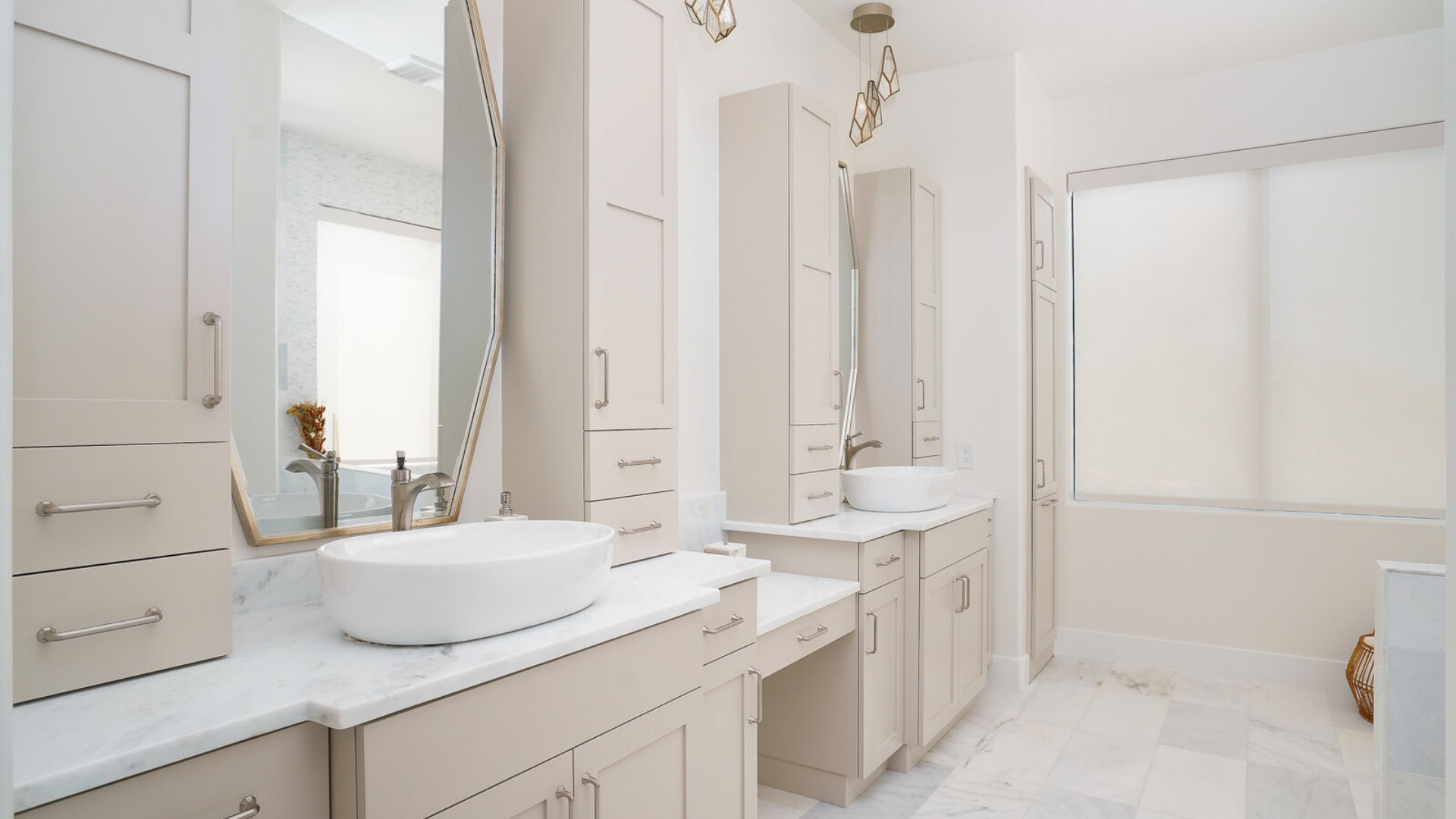
A spa-like bathroom starts with a layout that supports your routines, not just beautiful finishes.
The 5 layout mistakes
1. Not planning clearances
Tight entries & crowded vanities
Clearances are the invisible architecture of a bathroom. They’re the distances between fixtures like the shower entry to vanity, toilet to wall, swing radius of a door, and they’re easy to overlook on a floor plan. The moment you’re actually in the space, a 28″ vanity clearance feels tight. A 30″ shower entry that seemed passable becomes annoying with wet towels on a hook nearby.
Building codes set minimums, but minimums are rarely comfortable. Code might allow 15″ from toilet centerline to a side wall, but 18″ is far more livable for most bodies. We design to a comfort standard, not to code minimums.
What we aim for:
36″ in front of the vanity, 18″ on each side of the toilet centerline, and at least 32″ for a shower entry (36″ where the floor plan allows).
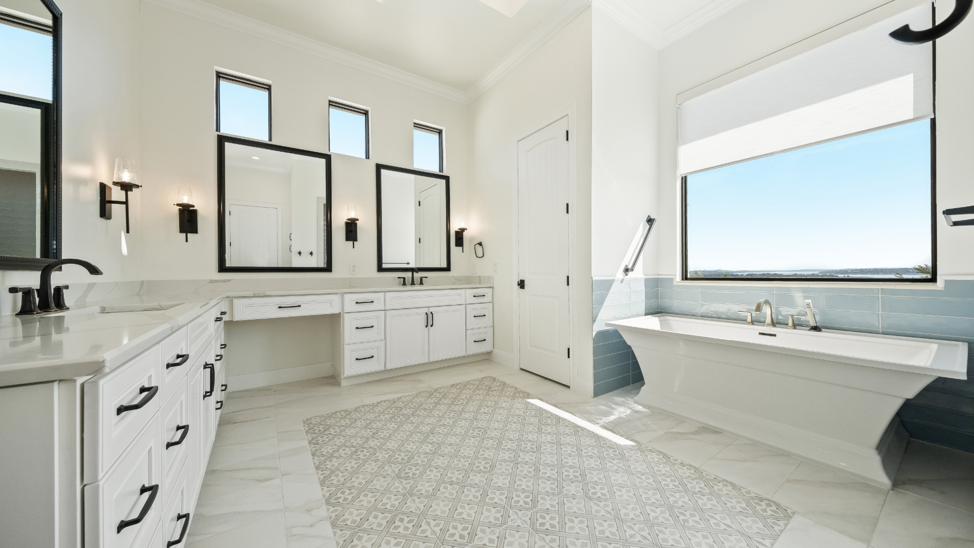
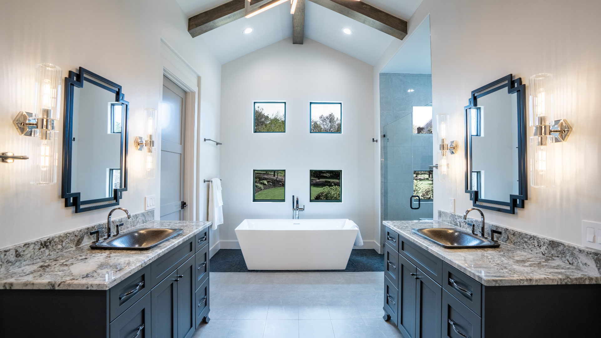
2. Door conflicts
Competing swings & tight corridors
Door swing conflicts are the most predictable layout problem, and one of the most common. A toilet room door, a frameless shower door, and the main bathroom entry can all end up fighting for the same floor zone. On a 2D plan, it looks fine. In real life, you’re doing a choreographed sidestep every time you move through the space.
We map every door arc early in the design process, before fixtures are set. Sometimes the fix is reorienting a swing. Sometimes it’s swapping to a pocket door or barn door where a swing would conflict. Sometimes it’s simply shifting a fixture 6 inches down the wall.
What we aim for:
Zero door arc overlaps. Doors that open away from the user where possible. Pocket or barn door hardware in constrained spaces.
3. Undersized shower
No bench, no niche, no drying zone
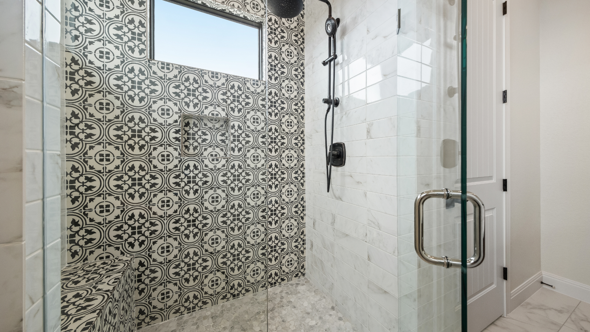
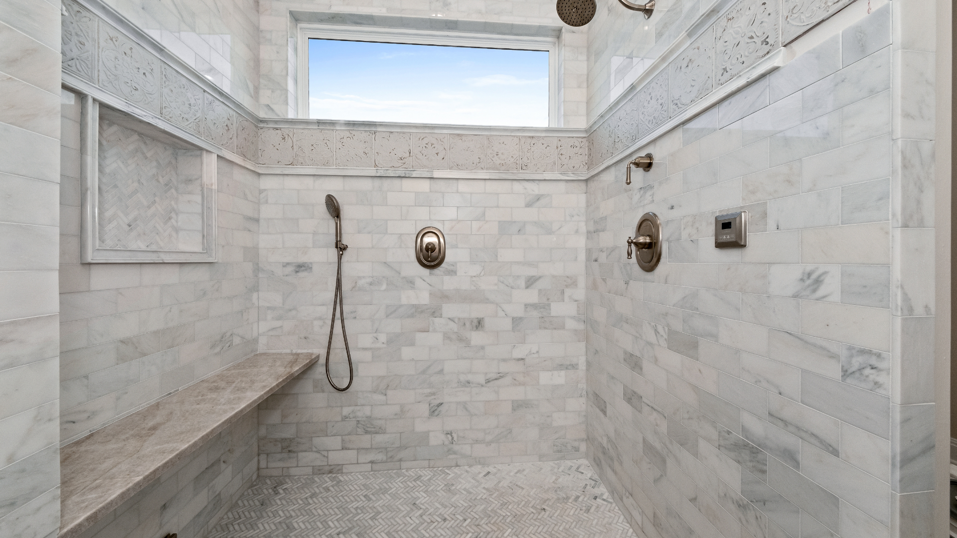
A shower may meet code on paper, but true comfort is felt in the way a space functions every day. While a 36″x36″ shower may technically work, it rarely delivers the open, spa-like experience most homeowners are hoping for. The shower is often where people want the “spa” feeling most, and it’s also where we see the most compromise. No room for a bench. No room for a built-in niche, so a wire caddy ends up hanging from the showerhead. The door swings into the spray zone. There’s no dedicated spot to dry off without stepping onto cold tile.
We try to get to at least 36″×48″ in most projects, and push toward 36″×60″ when the floor plan allows. A curbless entry with a linear drain can make a modest shower feel more open. And a drying zone, even 18″ of tile just outside the shower threshold, changes the morning routine significantly.
What we aim for:
Minimum 36″×48″ footprint with a built-in bench or niche where possible, curbless entry with linear drain, and a dedicated drying zone.
4. Skipping storage
Towels, toiletries & linens
Storage is where beautiful bathrooms quietly fall apart. The design looks clean and considered in the portfolio photos… but six months in, a wire rack is on the back of the door, a basket of overflow products sits on the floor, and towels are draped over the towel bar in a way that looked intentional in the rendering but doesn’t in real life.
We inventory what needs to live in the bathroom before finalizing the layout: daily products, extra rolls, backup linens, cleaning supplies. Then we design storage into the architecture with niches, recessed medicine cabinets, a vanity with drawers rather than doors, floating shelves where there’s vertical wall space.
What we aim for:
Storage designed from actual product inventory expectations. Recessed or built-in wherever possible. A dedicated home for every category before construction begins.
5. Lighting as an afterthought
No layers = harsh or dim at the wrong times
A single overhead fixture is the default in most bathrooms, and it’s almost always wrong. Overhead light casts downward shadows on the face, which is exactly what you don’t want when you’re getting ready. It creates a flat, clinical feel. And it gives you no flexibility: full-brightness fluorescence for a midnight trip to the bathroom isn’t a pleasant experience for anyone.
Thoughtful bathroom lighting should feel layered and intentional. Task lighting at the vanity helps with daily routines, ambient lighting softens the room overall, and accent lighting creates warmth and atmosphere. The combination is what transforms a bathroom from purely functional into something that feels designed.